Logo done for a local black/doom metal band from Denmark. The name reflects the anglicisation of the ancient nordic name of a jotun.
The toughest part was transferring the edgy and simple principles of the ancient nordic rune into a gothic, ...
I'm proud to unveil my latest logo. This logo belongs to the newly founded Danish grindcore band Fordærv, whos debut EP "Glasskår" will hit the streets through the label 42plader soon.
Pretty orthodox take on a black metal logo, complete with forced symmetrical lettering and inverted crosses. The original sketch even had a pentagram thrown in there as well. Fictitious band, made in 2011.
Sketched with pencil, inked with black Artline (0.5) marker, touched up on PC. -Jakob Goul
Had we gone forward with Warhound as a band, this may well have been our simplified logo. It's drawn together from the "full" logo as seen in this previous post.
Sketched with pencil, inked with black Artline (0.5) marker, touched up on PC. -Jakob Goul
Done in 2010 as a quick sketch, after having listened to a lot of pornogrind and cybergrind like Cock and Ball Torture, Rompeprop, Libido Airbag, Last Days of Humanity, Urinefestival and S.M.E.S.
Fictitious band.
Probably the name of at least 10 bands. I can't believe how fast I made this logo, I don't think it took me more than half an hour back then. Fictitious band. Done in 2011.
Freestyled with blue felt pen, touched up on PC. -Jakob Goul
From a time in 2010 when I was seriously running out of band name ideas. Yes, I know the K looks like an X. From what I gathered a necroscopy was pretty much an older version of the word necropsy, which is like an autopsy. Fictitious band.
Sketched with pencil, inked with black Artline (0.5) marker, touched up on PC. -Jakob Goul
I feel as though a friend of mine came up with this name when I wanted to draw a random logo once... Very inspired by Malodorous' logo. Fictitious band. Done in 2011.
Sketched with pencil, inked with black Artline (0.5) marker, touched up on PC. -Jakob Goul
Made in 2011 as I was contemplating getting serious with my logos. Lightning Death Logos came up during a demented brainstorm, but ultimately I made other plans.
Sketched with pencil, inked with black Artline (0.5) marker, touched up on PC. -Jakob Goul
Another gore-styled logo I recently uncovered from some old notebooks. Inspired by bands such as Frightmare, Ghoul, Lord Gore and Blood Freak. and made in 2011. Obviously, it's my own last name and not the name of some band (although there may very well be a band going by this name out there...)
Freestyled with black ball-point pen, touched up on PC. -Jakob Goul
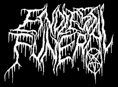
As I recall I was listening to a LOT of Nortt and Leviathan at the time I made this in 2010. I feel the urge to make a funeral doom tag... Fictitious band.
Sketched with pencil, inked with black Artline (0.5) marker, touched up on PC. -Jakob
Probably one of my more elaborate and ambitious logo designs. I went for the classic almost-illegible black metal bunch-of-twigs style. Done in 2010. Fictitious band.
Sketched with pencil, inked with black Artline (0.5) marker, touched up on PC. -Jakob Goul
A tribute or homage or whatever you want to call it to the Danish thrash band Battery. Not too different from their actual logo, and merely something I did for fun a few years ago. Also, alternate yellow version for added thrashening!
Just an 80's style chrome logo. Drawn and coloured entirely by hand.
Sketched with pencil, inked with black Artline (0.5 - 0.8), coloured with Faber-Castell felt pens, touched up on PC. Feel free to comment on technique and design below. -Jakob Goul
Named after Heinrich Cornelius Agrippa, famed occultist and philosopher. Sort of a mixed style with both black and death metal tendencies.
With and without border.
Sketched with pencil, inked with black Artline (0.5 - 0.8), filled with black Faber Castell felt pen, touched up on PC.
Feel free to comment on technique and design below. -Jakob Goul
Referring back to my previous post, I decided to revamp my old NOX logo. This time around it's more curvey, a little more organic and a little broader. I did two version of this new logo, and I can't decide which I like the best. Do you guys prefer ...